Thursday, 6 May 2010

TYPOLOGY

here is a book, which looks at a range of different authentic typefaces, which are predominantly, serif. the design in this book works well as it uses typefaces and fancy lines to make up the aesthetics of the design, this will be a major consideration for the fable project. due to the photographs being a strong part of the content it will be good to use a authentic typeface to act as a secondary form of aesthetics rather than using icons or other imagery.


130 ALPHABETS & OTHER SIGNS

Due to the Fable project being based on a playful concept and visual language, it will allow to experiment with a range of different typefaces for the design.

Saturday, 1 May 2010

ANTHONY BURRILL

http://www.anthonyburrill.com/

After Crits on the development of the Pretty Practical logo, i have found that the logo, which i have produced is not fitting the style of the product.
i have taken a symmetrical route, using a Spirograph style. this needs to made more appropriate for the product. so i will experiment with colour and more shapes in a similar manor to Anthony burrill. who creates depth and impact in his design through simplistic shapes, lines and colour.


Sunday, 18 April 2010

alejandra román - layouts

The use of Colour overlays helps break up the grid used and creates depth in the layout, this helps make each page feel unique and makes the design look visually appealing, the use of different stocks with in the design helps make pase the flow the the book, this would be nice approach for the design of the yearbook, introducing different stocks will increase the price, but could work well on the quotes pages.


Dale magazine.

-
A 72 pages cultural magazine, developed as a final project for college. It features several types of articles, a cultural activity agenda, and an artist dossier.

Ramon Lenherr- FISCHLI WEISS // THE WAY THINGS GO

http://www.behance.net/designtoforget
Here are some layouts produced by Ramon Lenherr, he has an intersting style, the use of collums are overlayed to craete intersting compotions for the layout.


The Way Things Go
Peter Fischli and David Weiss
_
is a 1987 art film by the Swiss artist duo Peter Fischli and David Weiss.
The machine is in a warehouse, about 100 feet long, and incorporates materials such as tires, trash bags, ladders, soap, oil drums, and gasoline. Fire and pyrotechnics are used as chemical triggers. The film is nearly 29 minutes, 45 seconds long, but some of that is waiting for something to burn, or slowly slide down a ramp.
_

Saturday, 17 April 2010

Srefan Kanchev- ICON DESIGN

Stefan Kanchev has a nice style for his logo and icon desings, they have impact, due to th simplistic use of shapes and one colour approach, this allows the logos to work on a range of levels in terms of size (large and small), alongside other logos and text. the fact that the icons and logos work strongly by themselves and alongside others makes them succesful designs.


Thursday, 15 April 2010

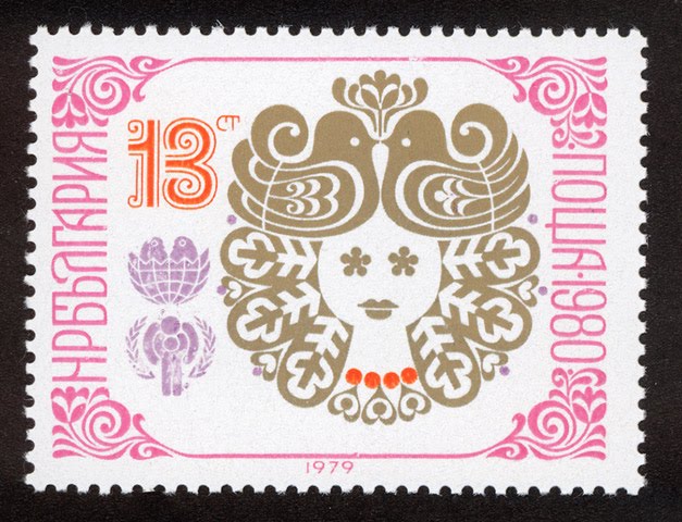
STEFAN KANCHEV- REALLY NICE illustrative style.

Here is a nice illustrative style by Srefan Kanchev, he has a intricate approach to produceing imagery, which works well with his use of a large colour palete, due to the use of block colour, this makes his designs perfect for print, his style also works in terms of balance and pattern.


http://stefankanchev.com/en/biography.html

KANCHEV, Stefan Kirov — applied graphic artist, honored with the Bulgarian State title “National artist” in 1971. He was born on 06 August 1915, in Kalofer, Bulgaria. His father was an iconographer. He studied mural painting in the National Art Academy (1940–1945) in the class of prof. Dechko Uzunov. Kanchev worked in all the areas of applied arts. He was an author of numerous covers of books with folklore fairytales, posters, trade marks, postcards, advertisements, forms and envelopes, post stamps, labels, packages and etc. His works are imaginative, with calm and clear composition, felicitous relation between fonts and shapes, clear forms and creative ideas. He got his inspiration from the Bulgarian folklore and traditions. Kanchev’s great artistry was also seen in his colour works. He participated in many exhibitions and biennales in Bulgaria and abroad: Belgrade, Budapest, Berlin, Moscow, Warsaw, Brno, Ljubljana and etc. In the first world exhibition of trade marks in New York he presented 23 works out of the 250 logos by authors from all over the world. He had solo exhibitions in Sofia, Moscow, Prague, Berlin, Warsaw, Budapest and anniversary exposition in Sofia in 1975. He won competitions for typefaces, posters, trademarks, postcards, telegram forms, book designs and etc. many times and his works are world-famous and cited in the major applied arts encyclopedias. He was awarded the order “Cyril and Methodius” 1st class (in 1956, 1963, 1969) for contributions to Bulgarian culture, the order “Red Banner of Labour” 2nd class (in 1975), the order “Republic Bulgaria” 2nd class (in 1975), the Alexander Zhendov prize for poster and applied graphics (in 1973), etc.